Friday, 19 May 2017

Things I Hate: Design Competitions

Have the chance to create work for a huge brand, seen worldwide and get a large model pencil as a reward, sounds pretty chill doesn't it? How could anyone hate that?


On the face of it, it seems like a pretty sweet deal—it's not too often as a student that Nike would approach you and ask you to do any work for them; so why would any company of their size do that through the means of a design competition? Perhaps they are just really generous people and want to give back to the community of their consumers. There certainly isn't any strange power imbalance here, certainly not! IT WOULD BE PREPOSTEROUS TO THINK OTHERWISE!

Design competitions are formulated to allow students to create work that they wouldn't otherwise be able to, be professionally critiqued on it and then even possibly be paid for it; it's a pretty good deal. Damn this Nike brief looks pretty awesome, you may say—but imagine instead of the powerhouse of trainers running this competition it was in fact a local plumber, with you paying £50 to pitch work alongside thousands of others in return for a possible pencil, would seem rather ridiculous, would it not?

Like everything else in our modern capitalist society, design competitions are programmed to exploit students and make it look as if they are getting a great deal instead. I mean, the rest of the design community have a staunch 'feck off' to anyone that may ask them for free pitching but we see it totally acceptable for the breadline generation to plow £50 en-mass to the middle man of design awards, in hopes that their £50 would be the one chosen not to be totally wasted.
Don't get me wrong, I think companies that have names that rhyme with 'Bee and A Bee' are doing good work, rewarding and reflecting the triumphs of modern design, accrediting creativity to the leading lights of our industry.

Like I said before, there is a power imbalance and it's creating an 'Overton Window' of social correctness, ever widening, enforcing a 'poverty-like' class on the creative undergraduates of this earth. I guarantee that in this years D&AD competitions there will be no single company that cannot afford design off their own backs, but instead allow you the privilege to pay them to see your free-of-charge spec work. Even if your work is never chosen, they've won.
At no cost to themselves, they've just received thousands of cutting edge, modern ideas and concepts which can be slowly churned all year, keeping their grubby, ink stained fingers briskly on the pulse of modernity.


Now, don't let me radicalise you just yet. It's very possibly I'm just a cynic as I've never won one and my views on the subject could be vastly different should I have bagged a bit of international freelance, some petty cash and a 2-foot pencil that says "Yes, I can design and other people think so too". I'm sure I would bask in it's glory, enlarging my cranium 8-fold as I swanned around my living room dancing with this enormous writing implement, to the greatest hits of Queen.

It's been known that I had a disagreement with Smint through their farcical competitions of past, so I have form to be a moody old codger; but if you give yourself a moment to analyse that proportionally only 20% of these competitions support charitable causes; it's big business giving itself a great round-of-applause at another successful year of draining all current, cutting edge ideas and pouring them into their flowerbed of existence. 

By now, you could be thinking "Fair point, I'll just not enter a competition and focus on paid freelance" but the fact that people take part isn't the issue; it's that it's allowed a poisonous mindset to worm its way into modern industry landscape. As a new graduate I attended New Designers, portfolio under my arm and a cheesy grin on my chops—filled with an air of enthusiasm. How that air released from my body so quickly when I chased up all 8 business cards I was awarded, to find that all these companies British Museum to River Island would love to have me, my work and my ideas but little to no want to actually pay for any of it.

From 2-week, unpaid internships that included free lodgings and breakfast like some kind of greetings card based wild west ranch; to 6-months, underpaid work in central London—they all shined like diamonds but cracked like cubic zirconia. The industry knows that with jobs being hard to come by, if they drop business cards like World War I propaganda they'll eventually manage to source that free or underpaid work they ever so – very clearly – need. #painfullyobvioussarcasm

As we draw this to a close, I'd like to change my original statement. I don't just hate design competitions, I also hate design expos and poisonous mindsets. I, in fact hate exploitation.
I assume many people have also come to this conclusion, just not in so many words—making the facetious statements "It'll look great in your portfolio" & "It'll be fantastic exposure" a common trait of the freelance community. These words have become the "I'm not racist, but" of the design industry. Repeated to ad nauseam.


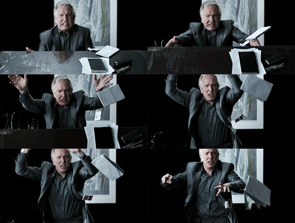
Remember this great man, Mr. Alan Rickman—he was once a designer but quit to become an actor due to falling out of love with design and it's traits. So I guess crap design things have one advantage.
I hate you exploitation.

Saturday, 13 May 2017

The Swastika: a great logo for terrible people

This post will not contain any images of Nazi's, their emblem or anything to that visual cue—but I think my point is already half proved how strong of an icon the Swastika is because you can already picture it in your head.


Science fiction Hitler
It's not a safe subject to touch on, but it's something I've been thinking about for a while—I mean it's hard to speak in favour of anything that involved our history some mere 70 years ago. I'm not going to explain how I disagree with the atrocities of past nor will I apologise for my point of view; I realise that for many people the Swastika will stand for everything they hate and every rational fear that shakes their bones, but it is something that existed, and should we spend the rest of the future pretending it didn't, then will will only be doomed to repeat ourselves.

Firstly, the Swastika as we know it is little more than rather clever plagiarism; it certainly wasn't a great idea of the German empire and the facist camp so believed. It's roots are thousands of years before Hitler got rejected from art school, used as symbol for good fortune in and around Hindu and Buddhist sacred spaces. With this meaning, it's no wonder it was idealised through bastardisation into the sharp, powerful symbol for a race striving for purity and exuberant fortune.

If you can get your brain based colouring pencils out, we can now explore what makes this twisted cross so imposing. Let's start with it's blood red outer circle, mathematically perfect in proportion, housing the inner blade sharp edges of the cross. With each arm extending to a strict 90 degree angle, turning to point their razor edges at the encompassing blood stained circular housing. Ironically, the similarities between this can the Japanese flag drew clear when the two fought under the banner of the Axis, flying this emblem of hate into the eyes of violent history.

As much as I hate it's existence, it's undoubtably a great logo, burning your skin and boiling your blood with the power it expels from it's weight of ignorance and blind hatred. It's arguable that is power and stance as a 'great' logo comes from the fear it demanded, whereas if the German empire had fallen on it's face before it could take it's baby steps into the wrong side of the history books, it would instead be seen as the sign of the failed and stupid. I think if we just look at how it's constructed, it'd be a hard battle to convince otherwise that the strict, harsh angles denote anything other than strong design, thrusting it into comparison with the modern heavyweights of iconic logo design.

I write about this because I find that even today, with our developed society that expels the ideology of cultural racism and genetic purity, this once loved icon is still gripping people with fear for where it once stood. Perhaps you wouldn't shriek to see it in a museum but say you visited a friends house and it hung upon their living room wall; then think how you'd feel. As we hold such value with logos of brands it's not surprising we imbue such fear into this twisted logo, but my thoughts are that we shouldn't allow it such power.

As someone that develops branding and logo for my chosen profession, I see the value and worth in the logo, the icon. But I don't believe it should ever be raised to the levels that we have allowed them to; thrusting them above our heads into god-like status, praising them with greater worth than that of an owned image should be allowed. Though, we have also demonised these shapes into great monsters – such as the swastika – allowing them to hurt us and scare us into the emotions that their creators wanted us to feel. No shape, no logo and no branding should be allowed this status.

Yes, the Swastika was a great logo because it did (and still does) exactly what it was created to do. It was created to spit at the past, bastardise the present and scare the future, and we stand here today allowing it to do so. Perhaps if we (as humans) can create something so wrong it can hold 'monster under the bed' like fear for our future generations, then we could also make something for good, inspiring and embracing our future; but I don't think we've cracked it yet. 

p.s. Nazi's suck.

Tuesday, 9 May 2017

Just the tip: Honesty

In a world where being dishonest causes very few waves, it's surprisingly important to be honest—you no good rotten raggamuffins!


Often it's said that you can lie on your CV and nobody will notice; assuming you don't claim to be a doctor or something. It's much harder to lie on your portfolio but I'm pretty sure it's doable. Plagiarism is certainly a thing and it's something that keeps art directors and creative directors awake at night, restlessly wrapping themselves around their covers wondering who will next be asked to create something from their portfolio to find that it was in fact a quick 'pinterest theft'.

There is a saying that goes along the lines of "Just because we can, doesn't mean we should", clearly this could be appropriated to almost anything but I certainly think that it smells just about right to scent the air of design dishonesty. Just because you weren't caught out today, don't assume you'll never be caught out—your superiors are in the same industry as you, and have been there for longer than you.

Ever famous design studio Snask built an empire, talks and a book on lies, or what they refer to as pink lies – essentially white lies, a little more camp/Snask – and though being dishonest has worked out well for them, just like them, be aware of the consequences of being dishonest before you swim the depths of the honesty pool.

Tip 1: Be honest about your limitations
We all want to see ourselves as strong, exciting creatives but it's important to understand the difference between where we want to be and where we are. Personally, I want to do everything and try solve every problem but it's important for me to understand that my ambition is separate to my knowledge. I can professionally make you a corporate identity but just because I've tampered with a Raspberry Pi at home, it doesn't make me suitable to write a full python script for operating a lighting system.

Tip 2: Be honest about your skills
Before I quoted that I could professionally make a corporate identity, but that was perhaps an exaggeration on my behalf, twisted by my own perspective. I believe I could create that, and I have created many logos before but there is a large difference between branding for a local business and that of a global franchise.

Tip 3: Be honest about the past
I'm not convinced many people would do this, but if you lie about a previous employer, you'll be caught out pretty bloody speedily. This will likely also apply to any false claims of study or internship—the creative field isn't that expansive, especially in the UK. This isn't just about bare faced lies either, if you have told your employer that you've taken on more responsibility before or tackled a certain task, make sure your up to facing just that in the future. Art direction isn't quite as simple as organising a small team in university.

Tip 4: Be honest to yourself
Once you've rapped yourself around an idea, it's hard to untangle that knot—especially if someone pulls harshly at the edges by rejecting your idea. Being honest with yourself is likely the hardest and most important tip of the five, because it takes the most effort. If you've ever found yourself being angry at requested or concise feedback, it's because someone is being honest with you and your not being allowing of honesty with yourself.

I can't describe to you on how to be honest with yourself, but if you can't figure it out; do what I do—get a fail safe, get a shit spotter. Mine is the other half and she's great at it. Here's how it works.

Firstly, she's dyslexic so if I've made any spelling mistakes, she'll spot them in a peco-second, as it's how she's survived for the last 23 years. Alongside that there is a process of identifying the crap; here's a step-by-step breakdown for anyone that would like to copy as I do.

  1. Show work to said 'shit spotter'.
  2. Ask said person whether they like the work, whether they understand it and if there is anything clearly wrong with it.
  3. Seek their answer, in the best binary form; good or bad.
  4. If they say "It's crap" assess it and see if you also think it's crap.
  5. If you find it's crap, then it is indeed crap. 
  6. If you find you have an argument to explain why it's not crap, then it isn't.
  7. Depending which path is taken, follow the correct action to fix or finalise the work.
  8. Make cuppa for said 'shit spotter'.


Tip 5: Be honest to another
It's simple, if someone asks your opinion, give it honestly.
If someone wants feedback, lie as if you were Ghandi—don't.


Not sure what's going on, but it looks good.
 
 
Copyright © Vincent Walden Sucks