Monday 26 June 2017

I am hypocrite

What's worse than being a hypocrite? Being a design hypocrite, of the result of your own blog writings.


It was merely weeks ago how I told all of you that I thought design competitions were a waste of time and now, here I am, hat in hand entering the GDFS Poster Competition. It's both a difference in perspective and very bold hypocrisy—so I shall draw my case; guilty or not guilty, I leave it to you, the jury to decide. Bang the hammer, call the verdict and lock me away—I'm probably guilty anyway.

So, to appeal to your better nature I shall depict to you all my reasonings for why I am not guilty, for I may be a hypocrite but I shall fight tooth and nail not to be incorrect.

It's different this time Like any good person driven down by an addiction, I believe in this instance for which I swore against is different, it's different because the schematics of the competition operate differently and there isn't a significant power imbalance.

There is no corporate interest Unlike in my previous writings, I had flamed big business for taking a large chunk of creative talent through desperation and hope, slicing away their ideas with the blunt blade of unpaid work. In this case, the competition is organised by a festival and the outcome of winning is exposure—real exposure, not the synonym for 'free work' we know it to be.

The work is not being stolen Any and all work submitted to the competition is not being taken to suit a real-world project. You can submit posters made in the past for previous projects, posters made for yourself or a poster designed specifically to celebrate the said competition—there isn't anything to be taken as there isn't any one thing to be made.


But wait, don't slam down your gabble just yet; I know the noise is very satisfying but you've got to hear me out—you can't just listen to the defendants and make your case, that's not how we work in a liberal society. So please, hear me out—these are the reasons why I'm guilty, like a sharply hidden dog round the corner from a half-devoured toilet roll.

It's not different this time I'm submitting work, to a competition where I know not who will handle my work, not who will judge it and have no idea what will happen to it—all on the promise of some money and exposure.

There is corporate interest Like any large body of design, there is corporate interest in what they do, what they are producing and how any business can incorporate themselves into these happenings to make their moral business compass point true 'trendy' north. Even if nothing is being taken and developed into a business idea, nothing exists for free and this competition certainly didn't cost me anything pence to enter.

Your work is being stolen The end goal of this competition is to have your pockets lined, your work showed and people look upon the work that is shown. Those people are looking for fulfilment, happiness, inspiration and ideas; just alike any good weekend museum stroller. Though there is no direct, inspired theft, there is always to be passive idea pilfering because that's how creativity works—especially any creativity that can come from observation.

Guilty or not guilty, I'll let you decide. But we should understand that we are all hypocrites; it just depends on what topics you are being hypocritical of, to how much of a profanely branded vulva you are. Perhaps my values will make me say one thing about design opportunities and do another but if you are being hypocritical of serious matters, then you should have a rethink.

Like my tutor told me, and now I'm telling you, "I might be talking total bollocks, but that's for you to decide". If I say competitions are wrong, then you need to look into what I'm saying to see not whether I'm being habitually factual to rather whether you agree or not – or even – whether I'm actually talking bollocks altogether. 

Sunday 18 June 2017

What defines a poster?

This fine Sunday, I entered the Graphic Design Festival Scotland poster competition with my most pretentious/boring/cool/trendy/wordy poster to date—you decide!

This is what I assume cool looks like.
As reminded by a good friend, I made sure to enter the GDFS Poster Competition this year, alongside two of my favourite posters of the past I created a bespoke poster for just this competition because I felt the desire to produce something I've never done before.

If you've ever been here before, you'll know I like two sections of design quite a lot—writing and posters. I've never really mixed the two and I've honestly never seen anyone else do it to a manner that I would deem interesting either, so why not give it a crack ey? I didn't want to just repurpose one of my writings onto a poster as that felt a little cheap; I wanted to make something that I didn't think they'd receive twice this year, that being a poster that holds an essay seeking to define the purpose and definition of the item it's laid upon.

I spent a few evenings with beer and musings to create this poster, in the manner I often do for just these blog posts; but unlike these, I did not want to create any visual excitement to the poster—leaving it obviously bland to focus upon its words and it's juxtaposition. In these posts, I use imagery and GIFs to break up the writing and give you a quick woo of excitement but that's not what I wanted of the physical poster, wanting its absence of visual excitement to be poignant. 
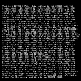
See the poster and its essay below.

You may need to zoom into this one.


What defines a poster? Officially classed as any item produced to create awareness through distribution and visibility, the poster is synonymous with a portrait printed page, found in shop windows, peeling from brick walls and in every live music venue ever. There is little that defines what a poster can or cannot be, but for the main part if you were to be presented half-masticated chewing gum on a post-it note; you would not instantly define it as a poster, but if used to be displayed in an attempt to raise awareness about chewing gum—by definition it is now a poster.

We typically regard the A3 printed page, as the standardised poster, though even changing this format from portrait to landscape instantly transforms the standardised poster format into an oddity. Anything above the size of A3 in ratio could be easily described as a poster from a great distance, but once this format reaches A5 or smaller we would regard the same information as a flyer. It's possible that we attain the definition of the poster to something we post thus defining it as something not particularly suitable for handing out or distributing by hand, like a flyer. When scaled to that the size of a billboard, we still observe the printed pages to be a poster but don't name it as such—the poster as we understand it exists in its familiarity, it's expected format and unspoken rule for the ratio.

If not defined by its dimensions, we often seek the expected hierarchy of Heading, Sub Heading, Date then content—this can be balanced differently with opposing and supporting imagery but the formula for the most effective information broadcast stays the same. Without the hierarchy we desire, does a poster cease to be a poster for it's not effectively transmitting the message or statement that it's assigned to do? It's possible that the lack of hierarchy could make a poster more effective (see the current one you are reading) when seen in juxtaposition to what we expect when our eyes clock onto the strict ratio of 1:1.4.

Even when removing the hierarchy to the best of your ability it's still impossible to be void of its concept, there is still a clear structure to the writing and the title is bolded (by choice) to define it from the main body of the writing. It's traditional to have a little text as possible upon a poster to make the content as easily digestible as possible, but confronted by this wall of text I doubt that you have been struck by the concept that what you are gazing upon is not a poster; whereas the existence of this poster stands against the conformity we expect of them.

If the technically defined purpose of the poster is not being met, then what purpose can be expected of a poster to this ethos? In the context of a design competition, a poster subverting the norm is perfectly acceptable but in a street, serving the purpose of awareness this would not have any legs to stand upon, both metaphorically and physically—it's paper after all people. Gosh.

For the sharp-eyed viewers or the people who are have allowed themselves the extra 30 seconds to reach this far into the amateur essay, printed enlarge on a flat displayed service for your reading pleasure; you may realise that the idea I'm exploring here isn't totally original. The 'making a large statement through subverting the expected using a large body of text on a black background' isn't in fact as original as I wish it was, it was actually employed by the band XTC in 1978, designed by the infamous Hipgnoisis for the album sleeve of Go 2. This statement is in full admission that the idea of the visual discourse of this poster has been derived from that source, like a highland stream of post-post design ideas.


In the internal ever rotating existence of the poster, the concept of ideas is a bizarre topic to dissect especially when the visual essay doing said incision is actually repurposing a rather famed idea to promote its message. It's poignant to assess the concept of ideas when also asking what defines a poster, as we only define something as a poster due to it having a descended idea from that of a similar item from the past. When we understand the current discourse of a poster from the ideas they've present in the past, is it fair to define what can and cannot be a poster—especially when we operate in an industry, now ever more evenly split between print and digital.

Now confronted with the question of what defines a poster and where the ownership of ideas and concept can sit, how can we then define the poster or even the idea for its format when we've radically leapt forward into the digital sphere after perpetually existing in a historical powerhouse of print. The terms of Print is Dead and Print is not Dead are thrown around, arguing the ground for both, with the latter most likely being supported by the poster economy like Atlas supporting his globe. As posters are beginning to create a market for themselves, reviving the print market with an ink based defibulator—but how do we define a poster in a digital space when we know what we expect of one in a tangible printed form.

We look upon a digital image and at the point of recognising it's 1:1.4 ratio we'll likely understand it to be a poster but when that is subverted, does it lose the right to it's poster definition? Does posting something digitally allow it to still be defined as a poster, even when the definition of poster comes from the physical act of posting something upon another surface? Does the ratio of the post also become irrelevant when we share a poster into a digital space like Instagram, with it's forced square ratio?

In the case of art, I believe that if something is created to be an artwork then we can define it as art rather than something being created then called art post-existence. If we create a piece of design in the aura to be a poster, does it become justified to be named a poster if it isn't physically posted or even in the ratio that we thrive to define it into, or even the hierarchy we search for?

It is known that posters are unlike buildings or sculptures for in both physical and digital instances, we understand a poster to be an ephemeral object, serving its purpose for a defined amount of time. This was originally a constriction brought upon the poster through its usage and materials, but now as we have an expansive digital space we may still treat the digital posters as ephemera but unlike paper and other decomposing resources of the physical poster it has the ability to last possibly forever, until our eventual cyber inhalation.

Now knowing that posters do not need their physicality, ephemeral existence or even the hierarchy we desire to be defined as a poster; it's worth asking what cannot be defined as a poster. If you are reading this in a physical sense, stood in a gallery or upon a street then it proves that even this self-evaluating monochrome image can be defined as a poster, judged by the poster judges that be. I hope that this series of questions, statements and wild contemplation have not felt like a waste of your time and that if you find this 'poster' surrounded by lots of other printed pages in a 1.14 ratio—you'll now analyse their existence in comparison to what you've found here.

Like many entities that exist in this world, we cannot define anything with a simple set of rules and the definition of design's hot ticket item – the poster – certainly cannot be put into the easy to define the category. So to conclude, what does define a poster? You.

Wednesday 14 June 2017

It's Grim Up North: with Lydia Leith

Lydia Leith is just your typical Londoner come Cumbrian, printmaker, ceramicist, sick bag producing fake tattooed designer. Of course.


As part of a newer idea, I'm hopping around the north interviewing creatives to prove or disprove whether it's grim up north—tea, cake, pint and pie in hand. First in the firing line is Lydia Leith, a local – not so local – known for making paper receptacles for you current event tummy spins and rather nice mugs. Though from her internet presence it could be known that she's an 'accidental entrepreneur' it's not as well known that she's quite a lovely helpful person; writing a list in collaboration with her family in preparation for our interview—though this list was so large in mass that I've had to not include it here in this post.

Lydia was originally born in London but around age 12 moved north with her family to pursue a more relaxed, family focused life. Carlisle, London, Edinburgh and Appleby have all been home for her, her family and the other half.


It's a poignant fact that her mother and father are artists, especially her father who is known nationally for his illustration and artworks—despite this fact, it's not a shadow that hangs over Lydia's being, for she is a creative being also, creatively successful in her own right. I would not have mentioned this fact should it not have featured in the questions, but should you be interested in his work or instead be a terrible bigot and believe that only men can create good work, see here to fill your creative/bigoted needs.

Lydia Leith


Photo credit: Dylan Collard

Who are you, where do you come from and where do you live?
I’m not really from anywhere I think, but I'm currently in Carlisle.

Who or what are your biggest influences? 
Inspiration is actually too big to capture in a paragraph, it comes from everywhere. Colours on a bus ticket, the pattern on a fabric, tissue paper wrapping under an orange, I collect the latter and it's surprising how many different designs you can find. I am a collector, I have boxes of bits of paper and packaging that I have saved, they are all little bursts of inspiration.

I've got some lovely hot chocolate sachets from a school trip to France when they served us hot chocolate for breakfast, I bet I am the only one from my class at school that kept these. It is a bit of a life time obsession but I guess I just appreciate that someone has designed everything, decisions have been made, what colour, what typeface for everything even a tiny apple sticker or a label on a stick of rock. Sometimes the nieve designs are the best.

But of course, I am inspired by all the usual suspects too.
Artists include Hockney, Picasso, Sonia Delaunay, Rousseau, Paolozzi, Kurt Schwitters, The Bauhaus—I could go on all day.
Illustrators and Designers FHK Henrion, Russian posters, Abraham Games, Robert Brownjohn, Kit Grover, Donna Wilson, Rob Ryan, Judith Kerr. Again it's endless.
Photography Martin Parr & Tony Ray Jones
Architecture Goldfinger's 2 Willow Rd.
Ceramics Carol McNicoll, Janice Tchalenko
Films Wes Anderson, Jacque Tati

I also can’t ignore the fact my father wouldn’t have influenced me. Both my parents are creatives so without them it’s not too likely I would have gone to art college.

I suppose I look up to designers who are just slightly older than me, I look up to their journey. Sometimes there it too much inspiration to look at and you have to shut it all out and just get on with some work!

How would you describe yourself as a creative?
Well I know one of my problems, I like to do too many things. Doing too many things at once.
 
I’ve recently got into pottery, my stock cupboard is full of printed papers, ceramics and I’ve even experimented with textiles in there. I like to just give everything a go.

My work is usually nostalgic, humorous, topical, or in many cases all three. Once I get an idea I will try any medium to make the idea become reality, this has lead me to use a range of materials plastic, ceramic, printed paper, magnets, fabric etc. I love variety and different materials. I enjoy finding out how things are made.

Being that London is the centre of British design, why here?
Many reasons, though mostly it’s because here we have a garden and the family is here.

Do you feel the north lacks culture or support for design?
We’re missing the fruit and vegetable selection, you can’t even get a ripe avocado. We do miss that but we’ve been visiting Manchester, London, Edinburgh. When we go to these places we’ll grab all the food we need and return with big heavy bags full of Harissa and Tahini.

I think you can get culture wherever you live, as long as you are motivated to find it.
People like to do interesting things, there are going to be a few good ones.

What items that you work with could not work without?
A computer, that’s a big one. My diary though—I’m holding it now, it’s my life. Everything goes in this book, if I lost it I’d be very unorganised.
Pencils, pencil sharpener.

What (design) work would you never do?
Only things that are morally wrong, that I disagree with. But also you do need to make money—though you wouldn't want to do an advert for the conservative or anything, would you?

Where does the north begin (or end)?

Birmingham is the middle, so it must start somewhere around Leeds.

People in London say Birmingham but they don’t know about anything north of there.

How do take your tea?

Usually, with a teapot. This goes with a mug overload at home, so try picking a mug, then add the milk, then the tea. No sugar.

What is the name for this?


A bread bun; what are the other options?
A bun. Not a roll; it’s quite fat.

Or a butty.

To see more of Lydia Leith's work, please visit her website, visit her father's current exhibition at Tullie House or (if you are a bit of an edgy character) sacrifice a range of milk tops under a full moon incessantly chanting the theme tune to Antiques Roadshow—she will soon appear. 

Saturday 3 June 2017

Problem makers or problem solvers?

Commonly, it's believed that designers should be problem solvers; you come to them with an issue and via the medium of visual wizardry they'll help solve said issue. But shouldn't we also be problem makers?


It seems a little backwards to suggest that we should create problems rather than solemnly solve them, but we should be allowed to make a fork in the road. We should decline leaflets where business cards will work better and we should suggest forest greens and sky blues when only black was specified.

At the core of it, design is problem-solving but that doesn't mean that the solution to the problem is always the solution that has been specified by the client. Clearly, it's important to listen to your client and hear what they are asking for, but I am suggesting that people who don't operate within the creative space, don't understand printing and its processes might from time to time ask for things that aren't suited for what they actually need.

I suggest we campaign to be problem makers—create alternative solutions and find different approaches. I realise it's a farfetched ideal to suggest that we should throw off the ropes and create what we want, but I think within any designers contacts list, they have the clients that they know will trust their opinion and allow boundaries to be pushed; like a sort of empathetic paddling pool.

To make problems, feels counter-intuitive, as clearly the client has asked for a solution and approaching them with more problems is the opposite of why they came to you—but I'm certain if we never made a problem for clients, for project and for the work we are gazing upon then perhaps we'd never reach the understanding of design we both personally have and globally realise.
We know you can't read text under 5 point because someone has asked for paragraphs of minuscule body copy only to realise it's like trying to distinguish between the moth and the lightbulb when trying to remove the winged beast from casting 3-piece-seat sized shadows all evening.


It's not a sustainable model to be always creating problems, as I doubt client after client will line up asking for logos, hoping that instead, you might produce a website or a set of leaflets—but for the correct client, with the correct job; it's a risk worth at least letting swim around your mind.

The American customer service solution of "The customer is alway right" doesn't service the industry of design like it does that of retail—it creates an artificial pedestal, raising clients to heights equal to that of Nelson's Column. Realising that they are bringing you the work and the money, they'll sit nicely in their chair of expectation, waiting for your email to see whether you've facilitated their every idea. 

If you've studied at university you'll likely have studied Graphic Design and not Graphic Facilitation—so create problems where problems are needed, as nobody ever strived forward by being supplied everything they needed when they asked for it. It's the struggle to develop something that makes an entity stronger by failure and success. 

You don't have to be a pain in the arse and constantly challenge what has been asked of you, but just like navigating with a car's GPS; if you feel that the solution being presented to you isn't the most correct one, you'll take that left turn to the anger of the automated voice. Perhaps once in a while, you end up staring at a brick wall in a builders merchants forecourt but you're also taking the risk that you'll understand the lay of the land better than the exterior entity directing you right, taking a much more scenic left—the more correct option for you at that time.

I hope you can figure out my strange GPS analogy, but if not; just make problems my child. 
 
 
Copyright © Vincent Walden Sucks