Monday 29 June 2015

You are GOLD!

ALWAYS BELIEVE IN YOUR SOUL!

Recently I've worked my butt off and helped stitch together tour footage of the lads of Colt 45, to make them a video for their cover of Spandau Ballet's 80's hit; "Gold".
It was a long process and considering I've never really edited anything serious before it was just as exciting as it was a learning curve—and what I learnt was; 20 seconds of video takes 20 minutes of editing.

But, it was bloody massive fun taking a huge leap out of my comfort zone and making three Cumbrian lad's look like they spent a weekend recording sweet music, and not drunkenly giggling at each other in a Wigan pub. Well actually that's a bit of a fib; they are very serious when it comes to their music, and it was a treat finding ways to edit this for them – having the privilege to scan through hundreds of clips of them, face focused, making the 80s sound like it was kicked in the balls by The Buzzcocks.

It also features on Kerrang, so that got me a little excited. I'm just rambling now, so just watch it.


Pat on the back Vin, pat on the back lads.

Saturday 20 June 2015

Shhhhhhh!

Keep your voice down will you! It's a SILENT disco. GOSH!

If you live around Carlisle you may of heard of The Brickyard's silent disco, it's where you shuffle in silence with headphones on, miming to people the universal sign for a drink – you know what I'm talking about; that little hand tilt you do in front of your mouth whilst raising your eyebrows.

Anyway, I got off topic, I was asked to re-do the poster for said night, and it was a bit of a strange one. I wanted to keep that childish, colourful vibe about it but I wanted to make it obviously my own.
So with little planning I just started grabbing images and throwing them together with text.

So if you look at the final, that is actually the idea I had right from the start, though after a short while I fell out of love with it. I started to look at it, and think – I like it, but I'd rather do something else. So I worked out this poster below.

Now this poster was an odd one, it was just a collection of things I had seen and liked. I used my favourite extension of Helvetica, got one of those wobbly borders and slammed on this anatomical face. In reality it has nothing to do with Silent Disco's and barely gets the message across, but in the wonderland of a mind; it looked bloody fab.

I had to come crashing back to earth when the guys at the yard realised they weren't in my fantasy world and said "we actually liked the first one". And to be honest, aesthetically this is lovely but for the purpose it's serving—I doubt it makes any sense.


So now we're back to good 'ol rusty, and that's how it's staying. Adventurous, modern Vincent is back in his closet and we are sticking to this. I mean it's not a bad thing, but it's what the client wants. And that is always priority. G'night!

Friday 19 June 2015

George, you are just so droll.

When you get a drunken poster request, you make a drunk poster.

So it's late in an evening, and what can I see but a drunken slump approaching me – it's Andy, the head honcho at The Brickyard. Through his face wide smile I can see he is asking me something "I NEED A POSTER" he says, "my band are playing and we need a poster".
This is the result. I don't know what else to tell you. They are called Droll Man, and who is a droll man? George W. Bush


End of transmission. 

Tuesday 9 June 2015

Really gunning for new clients

 Well, to make a long story short, I've got a new client and it's them local boys Colt 45.

Lets set the scene; I've just grabbed some piss sodden toilet paper out of a blocked stainless steel toilet, and as I plunder up the stairs to the sound of a hundred 14 year old's crying at some famous indie band, I see that the holy long haired mayor of The Brickyard (Andy) was talking to that there man of Colt 45 fame and I was being waved over to come talk to them.

After throwing away my pissed up latex gloves, I rushed back to find some cheeky chappy named Adam was offering me the chance to do some work for him, well actually it'd be for the band he furiously hits drums for. So of course I bit his hand off for the opportunity—wasn't my best move, had to spend hours in A&E, he'll never play the drums again. (sorry Gareth and Neil)

Anyway, some days past and I received an email with the opportunity to do design for Colt 45, and it all started with the possibility of a logo design; of which I jumped at the chance.
I looked at their current logo and thought it'd be best to work closely to what they already have but try and harp back to the punk style that these Fred Perry wearing northerners resemble. It was a rather short process, I worked through my fonts to see which font I could modify for my needs and could be modern enough to fit in with the current market that they'll be competing with.


Original Logo


Updated Logo


This poster above, was a huge influence for me for this redesign; as designed and drawn by that there moustached tattooed man Greg Wynne. I loved that semi-italic waved lettering he did on this poster and it was something I really wanted to embody in the re-design, not only that but he's been their designer for years, so it was an idea of respect for the image he helped build for them.

From this the first task to create a new facebook banner image and images for a merch sale for them, as an idea of reinforcing the branding whilst introducing it to their fans. So other than the logo I had created and their back catalogue, I hadn't much restrictions and just went at it.


Above was my first attempt, and it was quickly scrapped. Adam (from Colt 45) told me he liked it but it was the exact thing he wanted to get away from.
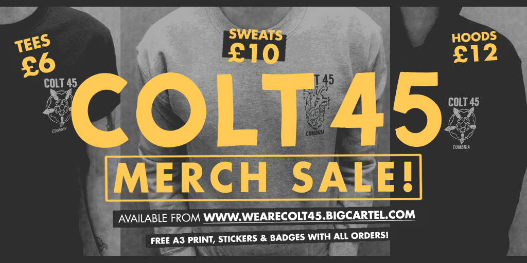
I was told that he wanted people to be able to see their faces, and for it to feel 'professional punk' – if that really exists; of which I would guess Elvis Costello would be the closest living embodiment to that term. So everything went grayscale and I cracked out a nice golden mustard colour.


And above are the finished products, of which I'm much happier with the Facebook banner due to the image having a great impact; and the images for the merch sale just proved awkward which ever way I tried to use them. But my satisfaction isn't always the best judge, as I got a message from a rather happy Adam that the merch had sold brilliantly after posting said image.

Aside from this, I am rather pleased with the overall look we've got going on – and I'm over the moon that they came to me for design.


It's been too long—too long.

Well, I've just noticed that I've not posted on this pile of words and images I call my blog.

So what have I been up to that's made me so busy that I couldn't make any blog posts? Well for the most part I can't actually tell you because it's a secret until release – so this'll be really bloody interesting won't it?

Well actually, I do have something little for you. I've recently been doing some chalk signs for a local cafe and aside from a few images of said boards—I do have a few action shots for you.
It's not quite squash, but it is a freckled middle-class white boy put chalk on a chalkboard; so it's still pretty feckin' dull to watch!

The concentration on this face makes your effort looks like sleeping son!


Action shot. That face.


Copyright © Vincent Walden Sucks