This blog, from this day forth is to exist as an archive.
I've had a good long run using Blogspot but after years of saying 'It's not that good, it'll do' and other sympathising remarks, I've reached the point where I just want to jump ship to the more superior of blog platfroms—the self-hosted Wordpress (sorry Blogger)
I'm of course continuing to blog as normal, and with this jump I'm hoping to launch my blog to a higher tier of existence, with great meta data, more common posts and more interesting things—but I'm only one boy, so it's likely only half of this may even happen.
So if you've landed here hoping for new content, I can but direct you to my new blog and hope that you may want to sift through the past 4 years of content that this website has provided.
Should I be so lucky to have a member of Blogger staff viewing this, then I shall explain my reasons for leaving. Since day one, the interface, operation and experience of Blogger has not changed which has been good for the most part but where it lacks has been completely ignore. I also realise that recently you've decided to try and update blogger but it's just too late, it's the vine of it's time, the GeoCities of the blogging words—it's been faithful but full of faults, like a 3 legged sheepdog.
Any how, have a deeks* at my new hizzity hang**.
*Deeks is a cumbrian word used in place of look, or 'to look'
**Hizzity Hang is a word that sounds trendy but has never been used non-ironically
Wednesday, 12 July 2017
Sunday, 2 July 2017
Just the Tip: Mindfulness
Mindfulness, I'm not talking about creating an Ohm at your desk, but taking a minute out—makes a world of difference.
I recently started a new job, and that job required me to work as a Graphic Designer—exactly what I've been doing for the past four years, so it shouldn't be too hard should it? I know how to design things, and that's why I was hired but what happens when you have internal panic, blocking all normal process? Nothing. Nothing happens.
Well, nothing useful anyway. Day to day, I could create endless shapes and forms in the lunch break as sort of creative cathartic release, but my work was lacking and I was just six steps away from being completely useless. In the pressure to be the best I could be for my new employers, I created abundances of stress for myself, clouding my head with anxiety and dread—not a common state for someone as laissez-faire as me. I had let the fear of not achieving, stop me for actually achieving anything.
I was so bogged down in fear that I was forgetting simple changes, mishearing easy instructions and basically creatively vomiting onto various Adobe software packages. It took two days away for my birthday, an honest and frank chat with the employers and a seismic shift in mindset to break free of the original Walden Creative Block '17 Edition.
I've never needed to rely upon actively seeking mindfulness but now that I've employed it once, it's become a great process for fixing issues before they've gripped a hold. So, should you need a space for your brain to do feck all every now and then, read on my beauties.
Tip 1: Get out, stay out and then return
Like a design based Jedi, piss off for a bit and come back—dependant on your availability upon the annual 'Piss Off for a Bit' calendar. If at most you can get 2 weeks, then go to Mexico and pretend not to see the crippling poverty you are facilitating in your enclosed holiday bureau and if you can merely get a longer lunch; go to that nice place with the slightly more fancy napkins and order that £22.50 dish that has no place being so darn expensive, because either way you'll have mentally distracted yourself enough to slowly begin the worm-like process of exiting the dark hole of creative struggle.
Tip 2: Getting from place to place, opens space for the mind to race
I find that I get my most free times mentally when I'm carrying myself down an ever constant path of repetition that I don't need to focus on where I'm heading, leaving time for focus on my head. From podcasts to music, if chosen correctly, you can zone out just enough to get where you need to but focus almost exclusively an external source you decide upon.
Tip 3: It's about the needing for reading
Now, this is quite a personal tip, but if you find yourself stuck in the loophole of blocked ideas; it can't hurt to try. Reading any good book requires one thing of its reader – absolute concentration – which mimics exactly that of Yoga, Meditation or most Cult-based activities. I would recommend non-fiction as you learn as you do it and you needn't imagine characters or places but if it comes to a pinch, I wouldn't turn down a good Harry Potter book.
p.s. if you are actually interested in using reading for mindfulness, as a creative I cannot recommend anything more highly than Penguin's Great Ideas collection. There are now about 100 of these short books, all with beautiful covers and extracts of not-so-ironically great ideas.
Tip 4: Lunch is a break
It's called a lunch break for a reason, so have a break, a walk, a run or a half hour cutting various shapes from sugar paper. The latter is my creative break, for when I have the time I make whatever shapes are spinning around my cranium; it's now developed into a bit of a thing of its own, under the branding of #lunchhour. A range of quick projects that set me free, it's rather fun.
So if making random crap isn't your scene, get outside and actually break from work. We have a lunch break because science defines we work better when we have breaks. Don't check those emails and don't pixel tweak, just bloody well get out that door!
Tip 5: Mindfulness doesn't end at the workplace
Allow yourself to tune-out, allow yourself to do nothing, allow yourself to make creative work without boundaries and allow yourself to be mindful when you need to.
It may be a little obvious that for me, this blog is an external project to allow myself to stop thinking about producing design and start critiquing it, flipping stress and anxiety on its head and making myself the master of them. Give yourself time when you have the time to, it's horribly refreshing to do nothing for a while.
It's not all singing bowls and vibrating your centrifugal sounds, do what works for you, for your brain, for your life.
Monday, 26 June 2017
I am hypocrite
What's worse than being a hypocrite? Being a design hypocrite, of the result of your own blog writings.
It's different this time Like any good person driven down by an addiction, I believe in this instance for which I swore against is different, it's different because the schematics of the competition operate differently and there isn't a significant power imbalance.
It was merely weeks ago how I told all of you that I thought design competitions were a waste of time and now, here I am, hat in hand entering the GDFS Poster Competition. It's both a difference in perspective and very bold hypocrisy—so I shall draw my case; guilty or not guilty, I leave it to you, the jury to decide. Bang the hammer, call the verdict and lock me away—I'm probably guilty anyway.
So, to appeal to your better nature I shall depict to you all my reasonings for why I am not guilty, for I may be a hypocrite but I shall fight tooth and nail not to be incorrect.
It's different this time Like any good person driven down by an addiction, I believe in this instance for which I swore against is different, it's different because the schematics of the competition operate differently and there isn't a significant power imbalance.
There is no corporate interest Unlike in my previous writings, I had flamed big business for taking a large chunk of creative talent through desperation and hope, slicing away their ideas with the blunt blade of unpaid work. In this case, the competition is organised by a festival and the outcome of winning is exposure—real exposure, not the synonym for 'free work' we know it to be.
The work is not being stolen Any and all work submitted to the competition is not being taken to suit a real-world project. You can submit posters made in the past for previous projects, posters made for yourself or a poster designed specifically to celebrate the said competition—there isn't anything to be taken as there isn't any one thing to be made.
But wait, don't slam down your gabble just yet; I know the noise is very satisfying but you've got to hear me out—you can't just listen to the defendants and make your case, that's not how we work in a liberal society. So please, hear me out—these are the reasons why I'm guilty, like a sharply hidden dog round the corner from a half-devoured toilet roll.
It's not different this time I'm submitting work, to a competition where I know not who will handle my work, not who will judge it and have no idea what will happen to it—all on the promise of some money and exposure.
There is corporate interest Like any large body of design, there is corporate interest in what they do, what they are producing and how any business can incorporate themselves into these happenings to make their moral business compass point true 'trendy' north. Even if nothing is being taken and developed into a business idea, nothing exists for free and this competition certainly didn't cost me anything pence to enter.
Your work is being stolen The end goal of this competition is to have your pockets lined, your work showed and people look upon the work that is shown. Those people are looking for fulfilment, happiness, inspiration and ideas; just alike any good weekend museum stroller. Though there is no direct, inspired theft, there is always to be passive idea pilfering because that's how creativity works—especially any creativity that can come from observation.
Guilty or not guilty, I'll let you decide. But we should understand that we are all hypocrites; it just depends on what topics you are being hypocritical of, to how much of a profanely branded vulva you are. Perhaps my values will make me say one thing about design opportunities and do another but if you are being hypocritical of serious matters, then you should have a rethink.
Like my tutor told me, and now I'm telling you, "I might be talking total bollocks, but that's for you to decide". If I say competitions are wrong, then you need to look into what I'm saying to see not whether I'm being habitually factual to rather whether you agree or not – or even – whether I'm actually talking bollocks altogether.
Labels:
hypocrite
Sunday, 18 June 2017
What defines a poster?
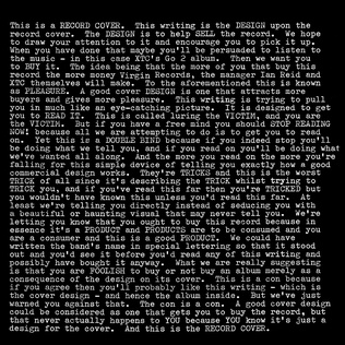
This fine Sunday, I entered the Graphic Design Festival Scotland poster competition with my most pretentious/boring/cool/trendy/wordy poster to date—you decide!
As reminded by a good friend, I made sure to enter the GDFS Poster Competition this year, alongside two of my favourite posters of the past I created a bespoke poster for just this competition because I felt the desire to produce something I've never done before.
 |
| This is what I assume cool looks like. |
If you've ever been here before, you'll know I like two sections of design quite a lot—writing and posters. I've never really mixed the two and I've honestly never seen anyone else do it to a manner that I would deem interesting either, so why not give it a crack ey? I didn't want to just repurpose one of my writings onto a poster as that felt a little cheap; I wanted to make something that I didn't think they'd receive twice this year, that being a poster that holds an essay seeking to define the purpose and definition of the item it's laid upon.
I spent a few evenings with beer and musings to create this poster, in the manner I often do for just these blog posts; but unlike these, I did not want to create any visual excitement to the poster—leaving it obviously bland to focus upon its words and it's juxtaposition. In these posts, I use imagery and GIFs to break up the writing and give you a quick woo of excitement but that's not what I wanted of the physical poster, wanting its absence of visual excitement to be poignant. See the poster and its essay below.
What defines a poster? Officially classed as any item produced to create awareness through distribution and visibility, the poster is synonymous with a portrait printed page, found in shop windows, peeling from brick walls and in every live music venue ever. There is little that defines what a poster can or cannot be, but for the main part if you were to be presented half-masticated chewing gum on a post-it note; you would not instantly define it as a poster, but if used to be displayed in an attempt to raise awareness about chewing gum—by definition it is now a poster.
We typically regard the A3 printed page, as the standardised poster, though even changing this format from portrait to landscape instantly transforms the standardised poster format into an oddity. Anything above the size of A3 in ratio could be easily described as a poster from a great distance, but once this format reaches A5 or smaller we would regard the same information as a flyer. It's possible that we attain the definition of the poster to something we post thus defining it as something not particularly suitable for handing out or distributing by hand, like a flyer. When scaled to that the size of a billboard, we still observe the printed pages to be a poster but don't name it as such—the poster as we understand it exists in its familiarity, it's expected format and unspoken rule for the ratio.
If not defined by its dimensions, we often seek the expected hierarchy of Heading, Sub Heading, Date then content—this can be balanced differently with opposing and supporting imagery but the formula for the most effective information broadcast stays the same. Without the hierarchy we desire, does a poster cease to be a poster for it's not effectively transmitting the message or statement that it's assigned to do? It's possible that the lack of hierarchy could make a poster more effective (see the current one you are reading) when seen in juxtaposition to what we expect when our eyes clock onto the strict ratio of 1:1.4.
Even when removing the hierarchy to the best of your ability it's still impossible to be void of its concept, there is still a clear structure to the writing and the title is bolded (by choice) to define it from the main body of the writing. It's traditional to have a little text as possible upon a poster to make the content as easily digestible as possible, but confronted by this wall of text I doubt that you have been struck by the concept that what you are gazing upon is not a poster; whereas the existence of this poster stands against the conformity we expect of them.
If the technically defined purpose of the poster is not being met, then what purpose can be expected of a poster to this ethos? In the context of a design competition, a poster subverting the norm is perfectly acceptable but in a street, serving the purpose of awareness this would not have any legs to stand upon, both metaphorically and physically—it's paper after all people. Gosh.
For the sharp-eyed viewers or the people who are have allowed themselves the extra 30 seconds to reach this far into the amateur essay, printed enlarge on a flat displayed service for your reading pleasure; you may realise that the idea I'm exploring here isn't totally original. The 'making a large statement through subverting the expected using a large body of text on a black background' isn't in fact as original as I wish it was, it was actually employed by the band XTC in 1978, designed by the infamous Hipgnoisis for the album sleeve of Go 2. This statement is in full admission that the idea of the visual discourse of this poster has been derived from that source, like a highland stream of post-post design ideas.
In the internal ever rotating existence of the poster, the concept of ideas is a bizarre topic to dissect especially when the visual essay doing said incision is actually repurposing a rather famed idea to promote its message. It's poignant to assess the concept of ideas when also asking what defines a poster, as we only define something as a poster due to it having a descended idea from that of a similar item from the past. When we understand the current discourse of a poster from the ideas they've present in the past, is it fair to define what can and cannot be a poster—especially when we operate in an industry, now ever more evenly split between print and digital.
Now confronted with the question of what defines a poster and where the ownership of ideas and concept can sit, how can we then define the poster or even the idea for its format when we've radically leapt forward into the digital sphere after perpetually existing in a historical powerhouse of print. The terms of Print is Dead and Print is not Dead are thrown around, arguing the ground for both, with the latter most likely being supported by the poster economy like Atlas supporting his globe. As posters are beginning to create a market for themselves, reviving the print market with an ink based defibulator—but how do we define a poster in a digital space when we know what we expect of one in a tangible printed form.
We look upon a digital image and at the point of recognising it's 1:1.4 ratio we'll likely understand it to be a poster but when that is subverted, does it lose the right to it's poster definition? Does posting something digitally allow it to still be defined as a poster, even when the definition of poster comes from the physical act of posting something upon another surface? Does the ratio of the post also become irrelevant when we share a poster into a digital space like Instagram, with it's forced square ratio?
In the case of art, I believe that if something is created to be an artwork then we can define it as art rather than something being created then called art post-existence. If we create a piece of design in the aura to be a poster, does it become justified to be named a poster if it isn't physically posted or even in the ratio that we thrive to define it into, or even the hierarchy we search for?
It is known that posters are unlike buildings or sculptures for in both physical and digital instances, we understand a poster to be an ephemeral object, serving its purpose for a defined amount of time. This was originally a constriction brought upon the poster through its usage and materials, but now as we have an expansive digital space we may still treat the digital posters as ephemera but unlike paper and other decomposing resources of the physical poster it has the ability to last possibly forever, until our eventual cyber inhalation.
Now knowing that posters do not need their physicality, ephemeral existence or even the hierarchy we desire to be defined as a poster; it's worth asking what cannot be defined as a poster. If you are reading this in a physical sense, stood in a gallery or upon a street then it proves that even this self-evaluating monochrome image can be defined as a poster, judged by the poster judges that be. I hope that this series of questions, statements and wild contemplation have not felt like a waste of your time and that if you find this 'poster' surrounded by lots of other printed pages in a 1.14 ratio—you'll now analyse their existence in comparison to what you've found here.
Like many entities that exist in this world, we cannot define anything with a simple set of rules and the definition of design's hot ticket item – the poster – certainly cannot be put into the easy to define the category. So to conclude, what does define a poster? You.
 |
| You may need to zoom into this one. |
What defines a poster? Officially classed as any item produced to create awareness through distribution and visibility, the poster is synonymous with a portrait printed page, found in shop windows, peeling from brick walls and in every live music venue ever. There is little that defines what a poster can or cannot be, but for the main part if you were to be presented half-masticated chewing gum on a post-it note; you would not instantly define it as a poster, but if used to be displayed in an attempt to raise awareness about chewing gum—by definition it is now a poster.
We typically regard the A3 printed page, as the standardised poster, though even changing this format from portrait to landscape instantly transforms the standardised poster format into an oddity. Anything above the size of A3 in ratio could be easily described as a poster from a great distance, but once this format reaches A5 or smaller we would regard the same information as a flyer. It's possible that we attain the definition of the poster to something we post thus defining it as something not particularly suitable for handing out or distributing by hand, like a flyer. When scaled to that the size of a billboard, we still observe the printed pages to be a poster but don't name it as such—the poster as we understand it exists in its familiarity, it's expected format and unspoken rule for the ratio.
If not defined by its dimensions, we often seek the expected hierarchy of Heading, Sub Heading, Date then content—this can be balanced differently with opposing and supporting imagery but the formula for the most effective information broadcast stays the same. Without the hierarchy we desire, does a poster cease to be a poster for it's not effectively transmitting the message or statement that it's assigned to do? It's possible that the lack of hierarchy could make a poster more effective (see the current one you are reading) when seen in juxtaposition to what we expect when our eyes clock onto the strict ratio of 1:1.4.
Even when removing the hierarchy to the best of your ability it's still impossible to be void of its concept, there is still a clear structure to the writing and the title is bolded (by choice) to define it from the main body of the writing. It's traditional to have a little text as possible upon a poster to make the content as easily digestible as possible, but confronted by this wall of text I doubt that you have been struck by the concept that what you are gazing upon is not a poster; whereas the existence of this poster stands against the conformity we expect of them.
If the technically defined purpose of the poster is not being met, then what purpose can be expected of a poster to this ethos? In the context of a design competition, a poster subverting the norm is perfectly acceptable but in a street, serving the purpose of awareness this would not have any legs to stand upon, both metaphorically and physically—it's paper after all people. Gosh.
For the sharp-eyed viewers or the people who are have allowed themselves the extra 30 seconds to reach this far into the amateur essay, printed enlarge on a flat displayed service for your reading pleasure; you may realise that the idea I'm exploring here isn't totally original. The 'making a large statement through subverting the expected using a large body of text on a black background' isn't in fact as original as I wish it was, it was actually employed by the band XTC in 1978, designed by the infamous Hipgnoisis for the album sleeve of Go 2. This statement is in full admission that the idea of the visual discourse of this poster has been derived from that source, like a highland stream of post-post design ideas.
In the internal ever rotating existence of the poster, the concept of ideas is a bizarre topic to dissect especially when the visual essay doing said incision is actually repurposing a rather famed idea to promote its message. It's poignant to assess the concept of ideas when also asking what defines a poster, as we only define something as a poster due to it having a descended idea from that of a similar item from the past. When we understand the current discourse of a poster from the ideas they've present in the past, is it fair to define what can and cannot be a poster—especially when we operate in an industry, now ever more evenly split between print and digital.
Now confronted with the question of what defines a poster and where the ownership of ideas and concept can sit, how can we then define the poster or even the idea for its format when we've radically leapt forward into the digital sphere after perpetually existing in a historical powerhouse of print. The terms of Print is Dead and Print is not Dead are thrown around, arguing the ground for both, with the latter most likely being supported by the poster economy like Atlas supporting his globe. As posters are beginning to create a market for themselves, reviving the print market with an ink based defibulator—but how do we define a poster in a digital space when we know what we expect of one in a tangible printed form.
We look upon a digital image and at the point of recognising it's 1:1.4 ratio we'll likely understand it to be a poster but when that is subverted, does it lose the right to it's poster definition? Does posting something digitally allow it to still be defined as a poster, even when the definition of poster comes from the physical act of posting something upon another surface? Does the ratio of the post also become irrelevant when we share a poster into a digital space like Instagram, with it's forced square ratio?
In the case of art, I believe that if something is created to be an artwork then we can define it as art rather than something being created then called art post-existence. If we create a piece of design in the aura to be a poster, does it become justified to be named a poster if it isn't physically posted or even in the ratio that we thrive to define it into, or even the hierarchy we search for?
It is known that posters are unlike buildings or sculptures for in both physical and digital instances, we understand a poster to be an ephemeral object, serving its purpose for a defined amount of time. This was originally a constriction brought upon the poster through its usage and materials, but now as we have an expansive digital space we may still treat the digital posters as ephemera but unlike paper and other decomposing resources of the physical poster it has the ability to last possibly forever, until our eventual cyber inhalation.
Now knowing that posters do not need their physicality, ephemeral existence or even the hierarchy we desire to be defined as a poster; it's worth asking what cannot be defined as a poster. If you are reading this in a physical sense, stood in a gallery or upon a street then it proves that even this self-evaluating monochrome image can be defined as a poster, judged by the poster judges that be. I hope that this series of questions, statements and wild contemplation have not felt like a waste of your time and that if you find this 'poster' surrounded by lots of other printed pages in a 1.14 ratio—you'll now analyse their existence in comparison to what you've found here.
Like many entities that exist in this world, we cannot define anything with a simple set of rules and the definition of design's hot ticket item – the poster – certainly cannot be put into the easy to define the category. So to conclude, what does define a poster? You.
Wednesday, 14 June 2017
It's Grim Up North: with Lydia Leith
Lydia Leith is just your typical Londoner come Cumbrian, printmaker, ceramicist, sick bag producing fake tattooed designer. Of course.
As part of a newer idea, I'm hopping around the north interviewing creatives to prove or disprove whether it's grim up north—tea, cake, pint and pie in hand. First in the firing line is Lydia Leith, a local – not so local – known for making paper receptacles for you current event tummy spins and rather nice mugs. Though from her internet presence it could be known that she's an 'accidental entrepreneur' it's not as well known that she's quite a lovely helpful person; writing a list in collaboration with her family in preparation for our interview—though this list was so large in mass that I've had to not include it here in this post.
Lydia was originally born in London but around age 12 moved north with her family to pursue a more relaxed, family focused life. Carlisle, London, Edinburgh and Appleby have all been home for her, her family and the other half.
It's a poignant fact that her mother and father are artists, especially her father who is known nationally for his illustration and artworks—despite this fact, it's not a shadow that hangs over Lydia's being, for she is a creative being also, creatively successful in her own right. I would not have mentioned this fact should it not have featured in the questions, but should you be interested in his work or instead be a terrible bigot and believe that only men can create good work, see here to fill your creative/bigoted needs.
Who are you, where do you come from and where do you live?
I’m not really from anywhere I think, but I'm currently in Carlisle.
But of course, I am inspired by all the usual suspects too.
Artists include Hockney, Picasso, Sonia Delaunay, Rousseau, Paolozzi, Kurt Schwitters, The Bauhaus—I could go on all day.
Illustrators and Designers FHK Henrion, Russian posters, Abraham Games, Robert Brownjohn, Kit Grover, Donna Wilson, Rob Ryan, Judith Kerr. Again it's endless.
Photography Martin Parr & Tony Ray Jones
Architecture Goldfinger's 2 Willow Rd.
Ceramics Carol McNicoll, Janice Tchalenko
Films Wes Anderson, Jacque Tati
I also can’t ignore the fact my father wouldn’t have influenced me. Both my parents are creatives so without them it’s not too likely I would have gone to art college.
I suppose I look up to designers who are just slightly older than me, I look up to their journey. Sometimes there it too much inspiration to look at and you have to shut it all out and just get on with some work!
As part of a newer idea, I'm hopping around the north interviewing creatives to prove or disprove whether it's grim up north—tea, cake, pint and pie in hand. First in the firing line is Lydia Leith, a local – not so local – known for making paper receptacles for you current event tummy spins and rather nice mugs. Though from her internet presence it could be known that she's an 'accidental entrepreneur' it's not as well known that she's quite a lovely helpful person; writing a list in collaboration with her family in preparation for our interview—though this list was so large in mass that I've had to not include it here in this post.
Lydia was originally born in London but around age 12 moved north with her family to pursue a more relaxed, family focused life. Carlisle, London, Edinburgh and Appleby have all been home for her, her family and the other half.
It's a poignant fact that her mother and father are artists, especially her father who is known nationally for his illustration and artworks—despite this fact, it's not a shadow that hangs over Lydia's being, for she is a creative being also, creatively successful in her own right. I would not have mentioned this fact should it not have featured in the questions, but should you be interested in his work or instead be a terrible bigot and believe that only men can create good work, see here to fill your creative/bigoted needs.
Lydia Leith
 |
| Photo credit: Dylan Collard |
Who are you, where do you come from and where do you live?
I’m not really from anywhere I think, but I'm currently in Carlisle.
Who or what are your biggest influences?
Inspiration is actually too big to capture in a paragraph, it comes from everywhere. Colours on a bus ticket, the pattern on a fabric, tissue paper wrapping under an orange, I collect the latter and it's surprising how many different designs you can find. I am a collector, I have boxes of bits of paper and packaging that I have saved, they are all little bursts of inspiration.
I've got some lovely hot chocolate sachets from a school trip to France when they served us hot chocolate for breakfast, I bet I am the only one from my class at school that kept these. It is a bit of a life time obsession but I guess I just appreciate that someone has designed everything, decisions have been made, what colour, what typeface for everything even a tiny apple sticker or a label on a stick of rock. Sometimes the nieve designs are the best.
I've got some lovely hot chocolate sachets from a school trip to France when they served us hot chocolate for breakfast, I bet I am the only one from my class at school that kept these. It is a bit of a life time obsession but I guess I just appreciate that someone has designed everything, decisions have been made, what colour, what typeface for everything even a tiny apple sticker or a label on a stick of rock. Sometimes the nieve designs are the best.
But of course, I am inspired by all the usual suspects too.
Artists include Hockney, Picasso, Sonia Delaunay, Rousseau, Paolozzi, Kurt Schwitters, The Bauhaus—I could go on all day.
Illustrators and Designers FHK Henrion, Russian posters, Abraham Games, Robert Brownjohn, Kit Grover, Donna Wilson, Rob Ryan, Judith Kerr. Again it's endless.
Photography Martin Parr & Tony Ray Jones
Architecture Goldfinger's 2 Willow Rd.
Ceramics Carol McNicoll, Janice Tchalenko
Films Wes Anderson, Jacque Tati
I also can’t ignore the fact my father wouldn’t have influenced me. Both my parents are creatives so without them it’s not too likely I would have gone to art college.
I suppose I look up to designers who are just slightly older than me, I look up to their journey. Sometimes there it too much inspiration to look at and you have to shut it all out and just get on with some work!
How would you describe yourself as a creative?
Well I know one of my problems, I like to do too many things. Doing too many things at once.
I’ve recently got into pottery, my stock cupboard is full of printed papers, ceramics and I’ve even experimented with textiles in there. I like to just give everything a go.
My work is usually nostalgic, humorous, topical, or in many cases all three. Once I get an idea I will try any medium to make the idea become reality, this has lead me to use a range of materials plastic, ceramic, printed paper, magnets, fabric etc. I love variety and different materials. I enjoy finding out how things are made.
Being that London is the centre of British design, why here?
Many reasons, though mostly it’s because here we have a garden and the family is here.
Do you feel the north lacks culture or support for design?
We’re missing the fruit and vegetable selection, you can’t even get a ripe avocado. We do miss that but we’ve been visiting Manchester, London, Edinburgh. When we go to these places we’ll grab all the food we need and return with big heavy bags full of Harissa and Tahini.
I think you can get culture wherever you live, as long as you are motivated to find it.
People like to do interesting things, there are going to be a few good ones.
What items that you work with could not work without?
A computer, that’s a big one. My diary though—I’m holding it now, it’s my life. Everything goes in this book, if I lost it I’d be very unorganised.
Pencils, pencil sharpener.
Pencils, pencil sharpener.
What (design) work would you never do?
Only things that are morally wrong, that I disagree with. But also you do need to make money—though you wouldn't want to do an advert for the conservative or anything, would you?
Where does the north begin (or end)?
Birmingham is the middle, so it must start somewhere around Leeds.
Birmingham is the middle, so it must start somewhere around Leeds.
People in London say Birmingham but they don’t know about anything north of there.
How do take your tea?
Usually, with a teapot. This goes with a mug overload at home, so try picking a mug, then add the milk, then the tea. No sugar.
Usually, with a teapot. This goes with a mug overload at home, so try picking a mug, then add the milk, then the tea. No sugar.
What is the name for this?
A bread bun; what are the other options?
A bun. Not a roll; it’s quite fat.
A bun. Not a roll; it’s quite fat.
Or a butty.
To see more of Lydia Leith's work, please visit her website, visit her father's current exhibition at Tullie House or (if you are a bit of an edgy character) sacrifice a range of milk tops under a full moon incessantly chanting the theme tune to Antiques Roadshow—she will soon appear.
To see more of Lydia Leith's work, please visit her website, visit her father's current exhibition at Tullie House or (if you are a bit of an edgy character) sacrifice a range of milk tops under a full moon incessantly chanting the theme tune to Antiques Roadshow—she will soon appear.
Labels:
it's grim up north,
lydia leith
Saturday, 3 June 2017
Problem makers or problem solvers?
Commonly, it's believed that designers should be problem solvers; you come to them with an issue and via the medium of visual wizardry they'll help solve said issue. But shouldn't we also be problem makers?
I hope you can figure out my strange GPS analogy, but if not; just make problems my child.
It seems a little backwards to suggest that we should create problems rather than solemnly solve them, but we should be allowed to make a fork in the road. We should decline leaflets where business cards will work better and we should suggest forest greens and sky blues when only black was specified.
At the core of it, design is problem-solving but that doesn't mean that the solution to the problem is always the solution that has been specified by the client. Clearly, it's important to listen to your client and hear what they are asking for, but I am suggesting that people who don't operate within the creative space, don't understand printing and its processes might from time to time ask for things that aren't suited for what they actually need.
I suggest we campaign to be problem makers—create alternative solutions and find different approaches. I realise it's a farfetched ideal to suggest that we should throw off the ropes and create what we want, but I think within any designers contacts list, they have the clients that they know will trust their opinion and allow boundaries to be pushed; like a sort of empathetic paddling pool.
To make problems, feels counter-intuitive, as clearly the client has asked for a solution and approaching them with more problems is the opposite of why they came to you—but I'm certain if we never made a problem for clients, for project and for the work we are gazing upon then perhaps we'd never reach the understanding of design we both personally have and globally realise.
We know you can't read text under 5 point because someone has asked for paragraphs of minuscule body copy only to realise it's like trying to distinguish between the moth and the lightbulb when trying to remove the winged beast from casting 3-piece-seat sized shadows all evening.
It's not a sustainable model to be always creating problems, as I doubt client after client will line up asking for logos, hoping that instead, you might produce a website or a set of leaflets—but for the correct client, with the correct job; it's a risk worth at least letting swim around your mind.
The American customer service solution of "The customer is alway right" doesn't service the industry of design like it does that of retail—it creates an artificial pedestal, raising clients to heights equal to that of Nelson's Column. Realising that they are bringing you the work and the money, they'll sit nicely in their chair of expectation, waiting for your email to see whether you've facilitated their every idea.
If you've studied at university you'll likely have studied Graphic Design and not Graphic Facilitation—so create problems where problems are needed, as nobody ever strived forward by being supplied everything they needed when they asked for it. It's the struggle to develop something that makes an entity stronger by failure and success.
You don't have to be a pain in the arse and constantly challenge what has been asked of you, but just like navigating with a car's GPS; if you feel that the solution being presented to you isn't the most correct one, you'll take that left turn to the anger of the automated voice. Perhaps once in a while, you end up staring at a brick wall in a builders merchants forecourt but you're also taking the risk that you'll understand the lay of the land better than the exterior entity directing you right, taking a much more scenic left—the more correct option for you at that time.
Friday, 19 May 2017
Things I Hate: Design Competitions
Have the chance to create work for a huge brand, seen worldwide and get a large model pencil as a reward, sounds pretty chill doesn't it? How could anyone hate that?
On the face of it, it seems like a pretty sweet deal—it's not too often as a student that Nike would approach you and ask you to do any work for them; so why would any company of their size do that through the means of a design competition? Perhaps they are just really generous people and want to give back to the community of their consumers. There certainly isn't any strange power imbalance here, certainly not! IT WOULD BE PREPOSTEROUS TO THINK OTHERWISE!
Design competitions are formulated to allow students to create work that they wouldn't otherwise be able to, be professionally critiqued on it and then even possibly be paid for it; it's a pretty good deal. Damn this Nike brief looks pretty awesome, you may say—but imagine instead of the powerhouse of trainers running this competition it was in fact a local plumber, with you paying £50 to pitch work alongside thousands of others in return for a possible pencil, would seem rather ridiculous, would it not?
Like everything else in our modern capitalist society, design competitions are programmed to exploit students and make it look as if they are getting a great deal instead. I mean, the rest of the design community have a staunch 'feck off' to anyone that may ask them for free pitching but we see it totally acceptable for the breadline generation to plow £50 en-mass to the middle man of design awards, in hopes that their £50 would be the one chosen not to be totally wasted.
Don't get me wrong, I think companies that have names that rhyme with 'Bee and A Bee' are doing good work, rewarding and reflecting the triumphs of modern design, accrediting creativity to the leading lights of our industry.
Like I said before, there is a power imbalance and it's creating an 'Overton Window' of social correctness, ever widening, enforcing a 'poverty-like' class on the creative undergraduates of this earth. I guarantee that in this years D&AD competitions there will be no single company that cannot afford design off their own backs, but instead allow you the privilege to pay them to see your free-of-charge spec work. Even if your work is never chosen, they've won.
At no cost to themselves, they've just received thousands of cutting edge, modern ideas and concepts which can be slowly churned all year, keeping their grubby, ink stained fingers briskly on the pulse of modernity.
Now, don't let me radicalise you just yet. It's very possibly I'm just a cynic as I've never won one and my views on the subject could be vastly different should I have bagged a bit of international freelance, some petty cash and a 2-foot pencil that says "Yes, I can design and other people think so too". I'm sure I would bask in it's glory, enlarging my cranium 8-fold as I swanned around my living room dancing with this enormous writing implement, to the greatest hits of Queen.
It's been known that I had a disagreement with Smint through their farcical competitions of past, so I have form to be a moody old codger; but if you give yourself a moment to analyse that proportionally only 20% of these competitions support charitable causes; it's big business giving itself a great round-of-applause at another successful year of draining all current, cutting edge ideas and pouring them into their flowerbed of existence.
By now, you could be thinking "Fair point, I'll just not enter a competition and focus on paid freelance" but the fact that people take part isn't the issue; it's that it's allowed a poisonous mindset to worm its way into modern industry landscape. As a new graduate I attended New Designers, portfolio under my arm and a cheesy grin on my chops—filled with an air of enthusiasm. How that air released from my body so quickly when I chased up all 8 business cards I was awarded, to find that all these companies British Museum to River Island would love to have me, my work and my ideas but little to no want to actually pay for any of it.
From 2-week, unpaid internships that included free lodgings and breakfast like some kind of greetings card based wild west ranch; to 6-months, underpaid work in central London—they all shined like diamonds but cracked like cubic zirconia. The industry knows that with jobs being hard to come by, if they drop business cards like World War I propaganda they'll eventually manage to source that free or underpaid work they ever so – very clearly – need. #painfullyobvioussarcasm
As we draw this to a close, I'd like to change my original statement. I don't just hate design competitions, I also hate design expos and poisonous mindsets. I, in fact hate exploitation.
I assume many people have also come to this conclusion, just not in so many words—making the facetious statements "It'll look great in your portfolio" & "It'll be fantastic exposure" a common trait of the freelance community. These words have become the "I'm not racist, but" of the design industry. Repeated to ad nauseam.
Remember this great man, Mr. Alan Rickman—he was once a designer but quit to become an actor due to falling out of love with design and it's traits. So I guess crap design things have one advantage.
I hate you exploitation.
Labels:
carlisle,
cumbria,
deadlines,
design,
graduate,
graphic design,
hate,
things I hate,
university of cumbria,
UoC,
vincent,
walden
Saturday, 13 May 2017
The Swastika: a great logo for terrible people
This post will not contain any images of Nazi's, their emblem or anything to that visual cue—but I think my point is already half proved how strong of an icon the Swastika is because you can already picture it in your head.
It's not a safe subject to touch on, but it's something I've been thinking about for a while—I mean it's hard to speak in favour of anything that involved our history some mere 70 years ago. I'm not going to explain how I disagree with the atrocities of past nor will I apologise for my point of view; I realise that for many people the Swastika will stand for everything they hate and every rational fear that shakes their bones, but it is something that existed, and should we spend the rest of the future pretending it didn't, then will will only be doomed to repeat ourselves.
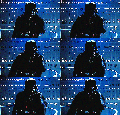 |
| Science fiction Hitler |
Firstly, the Swastika as we know it is little more than rather clever plagiarism; it certainly wasn't a great idea of the German empire and the facist camp so believed. It's roots are thousands of years before Hitler got rejected from art school, used as symbol for good fortune in and around Hindu and Buddhist sacred spaces. With this meaning, it's no wonder it was idealised through bastardisation into the sharp, powerful symbol for a race striving for purity and exuberant fortune.
If you can get your brain based colouring pencils out, we can now explore what makes this twisted cross so imposing. Let's start with it's blood red outer circle, mathematically perfect in proportion, housing the inner blade sharp edges of the cross. With each arm extending to a strict 90 degree angle, turning to point their razor edges at the encompassing blood stained circular housing. Ironically, the similarities between this can the Japanese flag drew clear when the two fought under the banner of the Axis, flying this emblem of hate into the eyes of violent history.
As much as I hate it's existence, it's undoubtably a great logo, burning your skin and boiling your blood with the power it expels from it's weight of ignorance and blind hatred. It's arguable that is power and stance as a 'great' logo comes from the fear it demanded, whereas if the German empire had fallen on it's face before it could take it's baby steps into the wrong side of the history books, it would instead be seen as the sign of the failed and stupid. I think if we just look at how it's constructed, it'd be a hard battle to convince otherwise that the strict, harsh angles denote anything other than strong design, thrusting it into comparison with the modern heavyweights of iconic logo design.
I write about this because I find that even today, with our developed society that expels the ideology of cultural racism and genetic purity, this once loved icon is still gripping people with fear for where it once stood. Perhaps you wouldn't shriek to see it in a museum but say you visited a friends house and it hung upon their living room wall; then think how you'd feel. As we hold such value with logos of brands it's not surprising we imbue such fear into this twisted logo, but my thoughts are that we shouldn't allow it such power.
As someone that develops branding and logo for my chosen profession, I see the value and worth in the logo, the icon. But I don't believe it should ever be raised to the levels that we have allowed them to; thrusting them above our heads into god-like status, praising them with greater worth than that of an owned image should be allowed. Though, we have also demonised these shapes into great monsters – such as the swastika – allowing them to hurt us and scare us into the emotions that their creators wanted us to feel. No shape, no logo and no branding should be allowed this status.
Yes, the Swastika was a great logo because it did (and still does) exactly what it was created to do. It was created to spit at the past, bastardise the present and scare the future, and we stand here today allowing it to do so. Perhaps if we (as humans) can create something so wrong it can hold 'monster under the bed' like fear for our future generations, then we could also make something for good, inspiring and embracing our future; but I don't think we've cracked it yet.
p.s. Nazi's suck.
Tuesday, 9 May 2017
Just the tip: Honesty
In a world where being dishonest causes very few waves, it's surprisingly important to be honest—you no good rotten raggamuffins!
Often it's said that you can lie on your CV and nobody will notice; assuming you don't claim to be a doctor or something. It's much harder to lie on your portfolio but I'm pretty sure it's doable. Plagiarism is certainly a thing and it's something that keeps art directors and creative directors awake at night, restlessly wrapping themselves around their covers wondering who will next be asked to create something from their portfolio to find that it was in fact a quick 'pinterest theft'.
There is a saying that goes along the lines of "Just because we can, doesn't mean we should", clearly this could be appropriated to almost anything but I certainly think that it smells just about right to scent the air of design dishonesty. Just because you weren't caught out today, don't assume you'll never be caught out—your superiors are in the same industry as you, and have been there for longer than you.
Ever famous design studio Snask built an empire, talks and a book on lies, or what they refer to as pink lies – essentially white lies, a little more camp/Snask – and though being dishonest has worked out well for them, just like them, be aware of the consequences of being dishonest before you swim the depths of the honesty pool.
Tip 1: Be honest about your limitations
We all want to see ourselves as strong, exciting creatives but it's important to understand the difference between where we want to be and where we are. Personally, I want to do everything and try solve every problem but it's important for me to understand that my ambition is separate to my knowledge. I can professionally make you a corporate identity but just because I've tampered with a Raspberry Pi at home, it doesn't make me suitable to write a full python script for operating a lighting system.
Tip 2: Be honest about your skills
Before I quoted that I could professionally make a corporate identity, but that was perhaps an exaggeration on my behalf, twisted by my own perspective. I believe I could create that, and I have created many logos before but there is a large difference between branding for a local business and that of a global franchise.
Tip 3: Be honest about the past
I'm not convinced many people would do this, but if you lie about a previous employer, you'll be caught out pretty bloody speedily. This will likely also apply to any false claims of study or internship—the creative field isn't that expansive, especially in the UK. This isn't just about bare faced lies either, if you have told your employer that you've taken on more responsibility before or tackled a certain task, make sure your up to facing just that in the future. Art direction isn't quite as simple as organising a small team in university.
Tip 4: Be honest to yourself
Once you've rapped yourself around an idea, it's hard to untangle that knot—especially if someone pulls harshly at the edges by rejecting your idea. Being honest with yourself is likely the hardest and most important tip of the five, because it takes the most effort. If you've ever found yourself being angry at requested or concise feedback, it's because someone is being honest with you and your not being allowing of honesty with yourself.
I can't describe to you on how to be honest with yourself, but if you can't figure it out; do what I do—get a fail safe, get a shit spotter. Mine is the other half and she's great at it. Here's how it works.
Firstly, she's dyslexic so if I've made any spelling mistakes, she'll spot them in a peco-second, as it's how she's survived for the last 23 years. Alongside that there is a process of identifying the crap; here's a step-by-step breakdown for anyone that would like to copy as I do.
Tip 5: Be honest to another
It's simple, if someone asks your opinion, give it honestly.
If someone wants feedback, lie as if you were Ghandi—don't.
There is a saying that goes along the lines of "Just because we can, doesn't mean we should", clearly this could be appropriated to almost anything but I certainly think that it smells just about right to scent the air of design dishonesty. Just because you weren't caught out today, don't assume you'll never be caught out—your superiors are in the same industry as you, and have been there for longer than you.
Ever famous design studio Snask built an empire, talks and a book on lies, or what they refer to as pink lies – essentially white lies, a little more camp/Snask – and though being dishonest has worked out well for them, just like them, be aware of the consequences of being dishonest before you swim the depths of the honesty pool.
Tip 1: Be honest about your limitations
We all want to see ourselves as strong, exciting creatives but it's important to understand the difference between where we want to be and where we are. Personally, I want to do everything and try solve every problem but it's important for me to understand that my ambition is separate to my knowledge. I can professionally make you a corporate identity but just because I've tampered with a Raspberry Pi at home, it doesn't make me suitable to write a full python script for operating a lighting system.
Tip 2: Be honest about your skills
Before I quoted that I could professionally make a corporate identity, but that was perhaps an exaggeration on my behalf, twisted by my own perspective. I believe I could create that, and I have created many logos before but there is a large difference between branding for a local business and that of a global franchise.
Tip 3: Be honest about the past
I'm not convinced many people would do this, but if you lie about a previous employer, you'll be caught out pretty bloody speedily. This will likely also apply to any false claims of study or internship—the creative field isn't that expansive, especially in the UK. This isn't just about bare faced lies either, if you have told your employer that you've taken on more responsibility before or tackled a certain task, make sure your up to facing just that in the future. Art direction isn't quite as simple as organising a small team in university.
Tip 4: Be honest to yourself
Once you've rapped yourself around an idea, it's hard to untangle that knot—especially if someone pulls harshly at the edges by rejecting your idea. Being honest with yourself is likely the hardest and most important tip of the five, because it takes the most effort. If you've ever found yourself being angry at requested or concise feedback, it's because someone is being honest with you and your not being allowing of honesty with yourself.
I can't describe to you on how to be honest with yourself, but if you can't figure it out; do what I do—get a fail safe, get a shit spotter. Mine is the other half and she's great at it. Here's how it works.
Firstly, she's dyslexic so if I've made any spelling mistakes, she'll spot them in a peco-second, as it's how she's survived for the last 23 years. Alongside that there is a process of identifying the crap; here's a step-by-step breakdown for anyone that would like to copy as I do.
- Show work to said 'shit spotter'.
- Ask said person whether they like the work, whether they understand it and if there is anything clearly wrong with it.
- Seek their answer, in the best binary form; good or bad.
- If they say "It's crap" assess it and see if you also think it's crap.
- If you find it's crap, then it is indeed crap.
- If you find you have an argument to explain why it's not crap, then it isn't.
- Depending which path is taken, follow the correct action to fix or finalise the work.
- Make cuppa for said 'shit spotter'.
Tip 5: Be honest to another
It's simple, if someone asks your opinion, give it honestly.
If someone wants feedback, lie as if you were Ghandi—don't.
 |
| Not sure what's going on, but it looks good. |
Labels:
carlisle,
cumbria,
design,
graduate,
graphic design,
honesty,
just the tip,
tips,
university of cumbria,
UoC,
vincent,
walden
Sunday, 30 April 2017
The digital disconnect
A lot of people spend all their life not knowing what they like to do and I guess I got it a little easier as from age 14 I knew I wanted to get into Design—but I was so disconnected from centuries of past design it's a wonder how I knew what I wanted to do at all.
My disconnect didn't really change until university where ironically outside of university I was introduced record collecting. There was something more tactile and desirable about these card envelopes that slowly connected me back the main pipeline of design history—especially when out of any good budget I started to collect almost exclusively early jazz records dating for the late 40's onwards.
For roughly 90% of it's existance design has been exclusively a subject of print, but for the boy that got hooked on making pixels colourful—it was strange plunge into the depth of pantones, inks and card. It could be argued that Graphic Design has existed since painting on cave walls or soap packaging in the roman era but in my eye, I reckon it started with typography, with the Gutenberg Bible. Though, if you are of greater faith than myself, it could also be argued that the part printed, part handwritten early Quran's beat Gutenberg to it.
Either way, I believe design started with moveable type, with desire and sales through an items design alone—ain't no caveman selling his wall. The Gutenberg Bible was created in 1455 and revolutionised design, so if you weigh those years up, I only became interested in design in 2008. I had 553 years of design behind me, most of which was print. I'd never indulged in anything particularly tangible and thus left with me with a horrible disconnect.
My teenage shelf held perhaps two books, three CDs and little ephemera because I was self-educated in pirating the early internet. I had no money and no desire for a CD because I could get it instantly, freely without any consequences—so that horrid plastic square can stay at the shop. I did think then as I do now, that computers are just about the best thing in the world, so I learnt how to do everything I could through a computer; this too included design, even if it was rubbish and bordering on misogynistic.
Just to clarify, I used to create signatures for in game money and a web-based RPG called Gangsters Paradise and almost everyone on there wanted to display how tough their internet gangster identity was by having rectangles displaying various guns, part-naked women and cars. It was terribly shite work that they requested, but I got recognition, in game money and most importantly creative freedom—as long as it included a bikini sporting lady.
 |
| for reference: this is the bikini island nuclear test (I think) |
I recollect being about 2 months into my current habit, surfing the my local hometown market, picking up what is otherwise a fairly common James Brown record and asking the stall attendant "Is this THE James Brown?". It's not something to be ashamed of as I knew no better, but as someone that would have claimed themselves a Hip-Hop head—you'd have thought that I recognise the world's most sampled man. As I walked home with a couple of records that I now realise were horribly over-priced it struck me how little I knew of design past, the people being designed for or the designers themselves. I knew structure and I knew trends and I avidly read Computer Arts magazine but if it had any date on it that didn't start with 2, I didn't have a flipping clue.
Records were my gateway to reconnect, to pull the plug on my digital cranium and throw it head first and the stinky, half damp sleeves of drug addicts that can play brass instruments really way—jazz artists that is. After I had bought out all the local stock of Mingus and Parker I had to find a new way to engulf the foreign experience of pre-computer design whilst avoiding the ever recurring James Last and 90s Dance promos. The answer was magazines, my favourites, but I wanted the oldest ones I could find. Design magazine from the 60's held the burning torch of post-war modernism that I was hungry for. Even now a year after I've graduated from university, I miss two things; the communal studio that we worked in and the library that hosted said magazines. They are rather delicious.
Finding these two interests of mine threw my design forward thousands of leagues, because I wasn't just referencing what I had seen last week—I was looking at periods of design that spend hours producing simple shapes and layouts, so they had to be of quality.
I find that the current issue with design is that it's being gripped with constant plagiarism and steered by a badly placed confidence in blindly following trends; like a seeing eye mule. The majority of the current designers bursting out of the colleges and universities likely have the problem that I had—everything was served to them, quickly, easily and just like the previous. There isn't any reason to look further because you can be satisfied with that exists on the screen alone if you never need look past it.
The digital disconnect is exactly what drives everyone to create a faux rustic logo with crossed arrows, or make everything have a heavy drop shadow with a 'flat' vector face. There is an experiment where a script uploads and image to instagram, saves it and uploads it again; over and over until the quality has been reduced to the point where it's completely unrecognisable. This is exactly what's happening with the machine, churning out endless carbon copies of lackluster design called modern design—driven by irrelevant hashtags and valued on likes. It's a facade that's slowly repeating itself until it reaches the centre of the maze and realises it knew not where it started.
Saturday, 22 April 2017
Spicy Memes
If you are in the age group of people that have no chance to buy property in central London, you'll likely have seen a spicy meme or two. It's pronounce meem by the way, not me-me or mem-ey.
Where as things created innocently can adopt meme status and spiral out of control worse than 2007 Britney Spears, some brands are recognising the social grip that memes have on popular culture and embracing them with all their copyright free goodness. Step into the ring, Gucci—a very high fashion brand, gripping and repulsing the youth market with their memes and expensive handbags.
For those of you unaware, a meme is little more than an internet joke; usually pictorial. They have no specific owner, no specific creator and mostly an unknown origin, but if you were to try and follow the meme stream it'd like go like this—4chan, Imgur, Reddit, Twitter & Facebook, World Domination.
Due to their lack of direct ownership, there is a clear lack of copyright in any particular meme; which is a very exploitable concoction. The copyright free Emojis of their time. This has been both exploited for commercial effect, societal degradation and heavy, heavy racism. At this point we reference the strange case of our lord and savior Pepe, that slightly sad looking frog that has now reached the realms of 'normies', twisted into a racist emblem and a rare reaction along the way.
Pepe was originally a character in Matt Furie's comic Boys Club; made famous by a panel in which Pepe pisses in the toilet with his pants full removed and testifies that it "Feels good man", quickly picked up by 4chan and other image forums as a response image. Though as it's frequency grew, people began to create their own and hide them away, making 'rare pepes' and adapting them to every situation, sadness, anger, happiness and blind xenophobia—a crudely drawn frog became the unified face of the outer reaches of anti-social web interaction.
Because of the popularity of a Pepe reaction, it was being adopted by almost every user of the outlandish, free-speak forums of 4chan; which unfortunately lead to a simple comic character being drowned in imagery of compromising viewpoints; being that a large section of 4chan's user group toe-the-line between socially unacceptable and bear-faced hate. Like a sad green frog being trapped in a snowball at the top of Mont Blanc, it quickly rolled down the mountain of popular culture to develop into a horrendously large boulder, to which its original existence could no longer be observed and this is when it was proudly adopted as a searing JPEG based flag for the far-right.
 |
| soz pep |
Though I think it's a bloody brilliant design stratergy to develop what is otherwise seen a snobbishly posh designer brand into relatable internet jokes, it's a bloody cheeky move if ever I've seen one—riding the wave of pre-created internet in-jokes without paying a penny of royalties. Though they didn't use Pepe, they still wouldn't have to have paid Mr. Furie a penny either as the standard internet 'pepe le frog' is different enough to be out of his copyright; the poor bugger.
A lot of meme hang heavily on current events or nostalgia, enforcing an – if slightly twisted – view on the modern world and the things happening around it, whether hilarious or tragic, they can all fall into a dark hole and become a meme. In my mind, they aren't as poisonous as we may think, which thousands of people dealing with serious situations by applying a sense of humor; or even using them as a gateway to freedom of speech, even if that is hate speech, it's still the freedom for them to say and express that. Long live the meme.
See above the 'starter pack' meme where people collect a range of stereotypes for various trends, groups and genres as a poke at their community. Often created by people who are passionate about said topic, laughing at the people who are new to said topic and are likely failing to expected stereotypes. Those arrogant, funny bastards.
There is no obvious name for this one, but it's adapted from a meme where people display their frustration with a screen cap from children's TV show Arthur; in an episode that tackles anger and violence and shows him clenching his fist from a profile stance. Of all of them, this is the one that is least changed, but the one I like the most, as it feels very high fashion with a little hint to internet humour, rather than a blatant reference—it's cleverly different enough from the original Arthur scene to be out of copyright too; those sneaky high fashion harlots.
As far as I can read on the internet, people of the internet are cringing very hard at this campaign; but as I'm not very attached to any particular meme, I think it was a bold step for a brand that arguably trades exclusively on it's image and reputation to embraces what are otherwise spews of collected internet humour.
All in all, as an avid user of the internet and the generation to grew up with it, seeing it turn from Geosites to Wordpress and MetaCafe to Youtube. I wouldn't have ever expected internet humour to have such a poignant space in society, never mind and recognised style and set name. It seems the Meme culture is certainly a digital representation of the youth, displaying it's problems with xenophobia, a thirst for freedom of speech and the sharing of a continual in-joke.
A lot of meme hang heavily on current events or nostalgia, enforcing an – if slightly twisted – view on the modern world and the things happening around it, whether hilarious or tragic, they can all fall into a dark hole and become a meme. In my mind, they aren't as poisonous as we may think, which thousands of people dealing with serious situations by applying a sense of humor; or even using them as a gateway to freedom of speech, even if that is hate speech, it's still the freedom for them to say and express that. Long live the meme.
Saturday, 15 April 2017
I don't get it
If you've ever been to a gallery, you've turned to the person next to you, or they turned to you and exclaimed the ever prevalent words "I don't get it" your figures over-shadowing a large red, mounted square.
The phrase itself is synonymous within any form of exhibition, design to performance; but it more often raises it's head when prompted by a lobster based telephone or a shark hovering in a solid embalmment. I've said it myself, and I've heard it many times also—the problem is that it's almost completely redundant. It's not wrong to be confused, but often we're looking for something that needn't be looked for, expecting something that doesn't exist.
We should be attending galleries not looking to understand everything, not looking to please just our eyes but instead something to please our soul, put fire in our bellies and sour our tongue. Often the fact an artwork isn't simply understood is part of it's existance, we shouldn't scan modern art the same way we have learned to deconstruct European Oil Paintings—with a term as broad as art we should understand that each piece is individual and can be understood in a totally different way.
We may often say that we don't understand as we aren't really trying to, we're looking at a crude constructed sculpture and trying to read it everything we currently know, looking for emotion in the finesse rather than just absorbing it's aesthetic wonder. Often we've been instructed to not understand the piece before us, in the case of minimalism or Dadaism, it doesn't need to be understood–l'art pour l'art.
To not understand is a human condition, and where art stands high and mighty in the spotless prestige of the gallery we exclaim our confusion in which to rebel against the pieces before us. "I don't get it" is a rebellion against the higher society we find ourselves standing against, to almost dismiss that it shouldn't be given such prestige if it cannot be understood by ourselves. Often it needs to be fought against but just accepted for what it stands to be—but as I also said, we're often looking to sour our tongue with pieces we search for disgust in, like a jewel encrusted skull or 120 bricks upon the floor.
I don't get it is a prominent and poignant term when assessing art but when applied to design, it's no longer a fair term of the common man (or woman) but instead terribly problematic. To not understand art can be part of it's aura but to not understand design is to heat up the branding iron and sizzle it into the upper thigh of it's creator, owner and distributor.
Like art, design is created in an aesthetic space but unlike anything hung on a gallery wall, it needs to be understood to be effective—it needs to be clear for it purpose; as without said purpose, it stops being design, or at least not design in it's purest sense. I believe it should be a strong and divisive metering of your work to see whether what has been designed can be understood by the people who would consume it's imagery, it's message and it's existance.
For an example, the most publically obvious aspect of design is a logo. Good or bad, every company has one and should you poll every citizen of Milton Keynes I'm sure you'll find that the average human would relate design to exactly that. The Nike logo is the most recognisable logo I can think of, so we'll work with that one.
It's origin isn't directly obvious but the radical nature of it's 'swoosh' suggests something exciting; though you may have never seen it before, it's very clearly it's not the logo for your local washing machine repair shop is it?
Now the logo may feel sporty to us because it's so ingrained into our lives as the ultimate symbol for sport, health and fashion but a hard as you try, it's hard not to understand that it's a shape driving a fast, slick motion from one point to another. Ask yourself, have you ever picked up a Nike product, looked at the embezzled Swoosh and turned to the shop attendant to say "I don't get it".
The difference here is that design cannot carry the ambiguity that art does, it has to be read for the message it's owners need rather than the message to viewer of any given artwork could attach to a Rothko. Though clearly, design can be made to be misunderstood or enigmatic and this works well for the radical brands that adopt them, but even now these confusing logos still reflect the message they are selling—Supreme, Palace, Soylent etc.
Next time you want to explain that you don't understand Tracey Emin, or Damien Hirst give it a second and try to not understand and just take it for what it is—eventually you'll realise what stands before is likely shite, but it's art so there isn't much more to understand about it other than that.
But if you want to say the same about design, speak with it's curator and if it still doesn't make sense, buy some beers, a pack of tissues and let them know; they may cry, they may get angry but if they are clever, they'll listen and eventually you'll create better design for the masses. You bloody champ.
Labels:
Art,
carlisle,
cumbria,
design,
graduate,
graphic design,
I don't get it,
understanding,
university of cumbria,
UoC,
vincent,
walden
Monday, 10 April 2017
Thank god for emojis
It's not particularly cutting edge to refer to Emoji's as the modern youth's Hieroglyphics—but clichés aside, they are rather good fun. Even if I do admit it myself.
What started as developed smiley faces, has now developed to cryptic sexual consumables and emoticons suitable for threatening life itself with. I used to rather detest sending or receiving a little yellow face, sparkle or spontaneous vehicle but now I've caught the bug – a few years late, might I add – and now I can't help myself; forever attaching them to everything. You only need to check my instagram to see a cornucopia of unrelated sparkles, hand gestures and faces in the caption of nearly every post.
Though they are ugly as sin – design wise – they are a great development to a third party emoji library, rather than just mildly copying what already exists, through making them slightly less iconic. They've taken the subtle, ripped it apart and opened their own market for pictorially asking for 'Dick Picks' and defining the Top or Bottom preferences of any and all of it's users.
 |
| (GIF unrelated) |
Now as they grow in popularity, they clearly needed to adapt to their wider market; introducing various skin-tones and genders to hundreds of different icons, though as hard as they try, the 'eggplant' icon will never truly represent the vegetable it aesthetically refers to.
Now, third parties jumping on this popularity bandwagon, creating their own replicas of the official set to be hosted upon their own platfroms, which in the case of Twitter has created an open-source library of infinitly scalable icons—just in case you want to express your desire for butts on a letterhead or a billboard. Which isn't all that bad is it?
While the rest of the world makes more icons, to be misused as subtle references to penises and beyond, the brave old soles at Grindr (gay dating app) blew the modesty out of water, with a hardcore library of very, very clear, yet still slightly enigmatic emojis.
 |
| Little explanation needed here |
It's a refreshing dive into the depth of popular culture to see such an iconic modern trend be adapted to suit it users rather than just reinforce the 'hip and trendy' nature of any particular silicon valley company. I'll be sick if I have to see another ugly interpretation of the Turtle icon, but a skin coloured aubergine—hell yeah!
Thank god for Emojis, how else would we explain we have penis on the mind, pretend to be a monkey releasing a secret or threaten ex-lovers—all encased in a 10x10 icon. If aliens should want to communicate with us, lets hope they've got some kick ass icons themselves; because mathematics just aint going to cut it for me.
Sunday, 26 March 2017
Things I Hate: Designing for nobody
In my eyes, design is something initiated by a problem—design itself being a solution. It drives me nuts when I see things created for nobody, no reason, effectively no problem.
"Wait a minute, it's for sale. I can just spend money and now I've got the perfect logo. Wow isn't design great—those agencies are such rip-off merchants. I've saved so much money!"
There seems to be a big culture of designing for nobody spinning around the outer layers of the industry, the 'pre-made logo' sales being the sore thumb sticking up towards me. As I line up my hammer to bluntly extinguish the existence of this metaphorical meat prosthetic, I can see in it's sweaty reflection how it's cheapening the industry—allowing the general public to believe that design is a space to simply facilitate their identity through convenience rather than the problem solving task it really is.
 |
| Come get your 90's .com logos, only $400! |
Above displayed is a poisonous leech, misleading people to believe that they could just buy design as an item rather than a creative process, it's design's answer to the worn in the entrance to the Labyrinth. Ironically if you look at the prices of this small snippet of generic icons, you'll see for the most part a student could be happily paid half these prices to produce something much better.
Though I cannot find the quote I believe a big cheese designer once said something along the lines of "Bad design costs more than good design"; which seems rather poignant here. For these look nice(ish) but they are bad design not because of their aesthetics but instead because of their poor suitability, their irrelevance to the actual brand—they were made for nobody, so work for nobody.
It's not just a small isolated problem of one or two websites selling the utopian ideal of buying the perfect logo—I find social media to be full of these annoying bloody things.
See above; it's a juicy stake of what every lazy corporate business person desires. It looks modern, minimal and it's animated; how could you ever be so lucky!
"I get this logo and place it on my website this afternoon, just above my heavily copy-written 'company mantra', that'd be great!"
"Wait a minute, it's for sale. I can just spend money and now I've got the perfect logo. Wow isn't design great—those agencies are such rip-off merchants. I've saved so much money!"
Though it's a rife problem, as always there are exceptions to the rule—let me introduce you to Logo Pizza. A studio poking fun at the pre-made model but all the while making it a profitable experiment.
Logo pizza was a self initiated project from Metafizzy in which 50 pre-made logo were up for sale, though as one sold the price of the next logo would be $20 more expensive; meaning the faster you snapped one up, the cheaper it would be. Now, after a couple months of existence, it's developed a stalemate at a sizable $820 per logo—which isn't too bad for a little side project.
At the end of the day, I'll still rest my head on the pillow with a seething hatred for the 'pre-made' design culture—I imagine it's the same cheapening factor that fans of Slayer feel when they see a hoodie in Topshop, but it doesn't distract from the fact in both cases, they are very profitable for the humans who have consciouses in a different disposition.
Designing for nobody, I hate you; you can do it sort of right but it still doesn't make any sense to me. You are the lazy-man's branding solution and you are the punching bag of trends, clichés and irrelevance alike. I hope you're proud of yourself.
Labels:
carlisle,
cumbria,
deadlines,
design,
design for nobody,
graduate,
graphic design,
hate,
logo,
nobody,
pre-made,
things I hate,
university of cumbria,
UoC,
vincent,
walden
Subscribe to:
Posts (Atom)
